2025
November Cafe Branding
Timeline
3 months
Client
Personal Project
Industry
Restaurant & Hospitality
Tools
Procreate
Illustrator
Figma
Illustrator
Figma
Summary
In order to increase brand awareness, November Cafe seeks a comprehensive brand strategy, complete with a full brand package (logo, colour palette, iconography, cafe merchandising), a responsive website design, and additional promotional assets for flyers and social media.

Challenge
November is a late-night cafe situated in the Annex, a neighbourhood rich in victorian architecture and next door to University of Toronto's St-George campus. November is a alcohol-free establishment for night owls looking to finish their last-minute assignments, or just socialize without the pressure to drink.
Toronto's cafe scene is oversaturated, making it difficult for new establishments to carve out a unique identity and attract a loyal customer base. November Cafe faces the critical challenge of differentiating itself in a highly competitive market, beyond just offering quality coffee.
Toronto's cafe scene is oversaturated, making it difficult for new establishments to carve out a unique identity and attract a loyal customer base. November Cafe faces the critical challenge of differentiating itself in a highly competitive market, beyond just offering quality coffee.
Insights
1. Generic designs fail local brands: minimal designs, while suitable for ubiquitous brands, hinder small businesses in establishing a distinct identity.
2. Authenticity drives engagement: studies have found that 90% of Gen Z consumers believe authenticity is crucial when deciding which brands to support.
3. Maximalism is back: There's a notable shift from minimalism to ornamentation (ie. Burberry's 2023 rebrand, castlecore, and gothic films).
Moodboard
.png)
source: Pinterest
Solution
Rather than adopting the minimal, ubiquitous designs common to large chains, I recognized an opportunity to imbue November with a sense of personality and place.
The approach for November Cafe is to transcend generic minimalism and lean into the rich architectural heritage of the Annexe neighbourhood. By infusing the local Victorian and Neo-Gothic aesthetics directly into the brand identity, the aim is to make November Cafe a distinctive landmark.
The visual identity paired with the "dark academia" aesthetic (late night studying, playing chess, classic literature) create a direction that isn’t merely decorative; it’s a deliberate choice to:
1. Establish a visual language: instantly set November apart from its modern competitors with a style that stands above the rest.
2. Reach the right audience: the copy and refined aesthetic communicate the cafe's late-night programming and alcohol-free environment.
3. Communicate an experience: think dark woods, plush textures, a cozy and quiet ambiance. Perfect for reading, studying, or relaxed hangs.


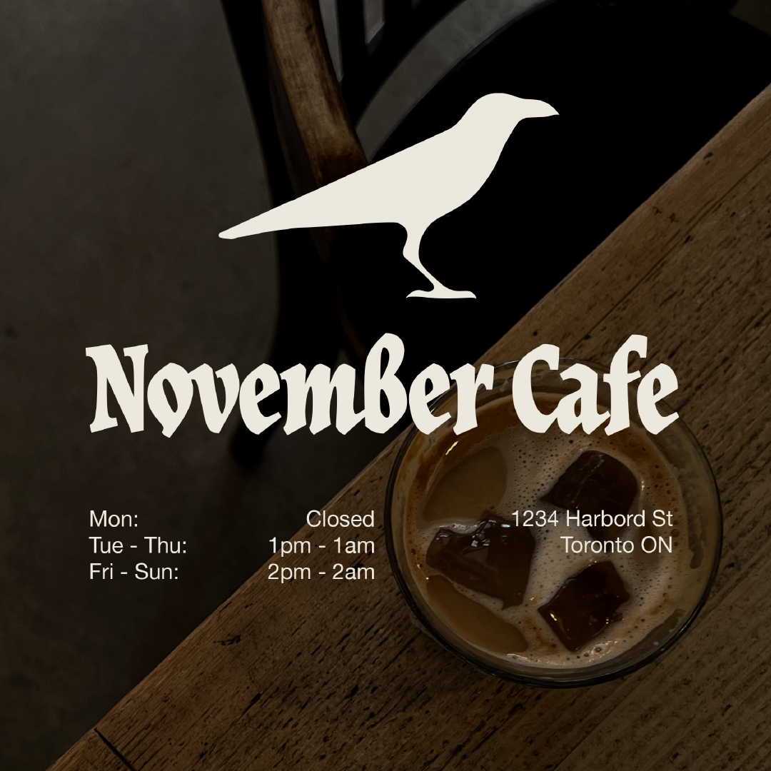
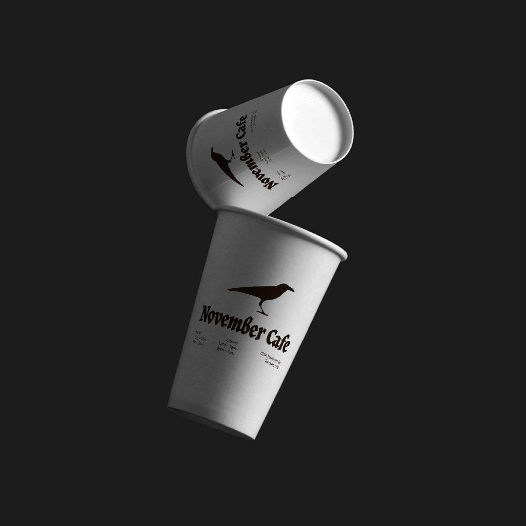
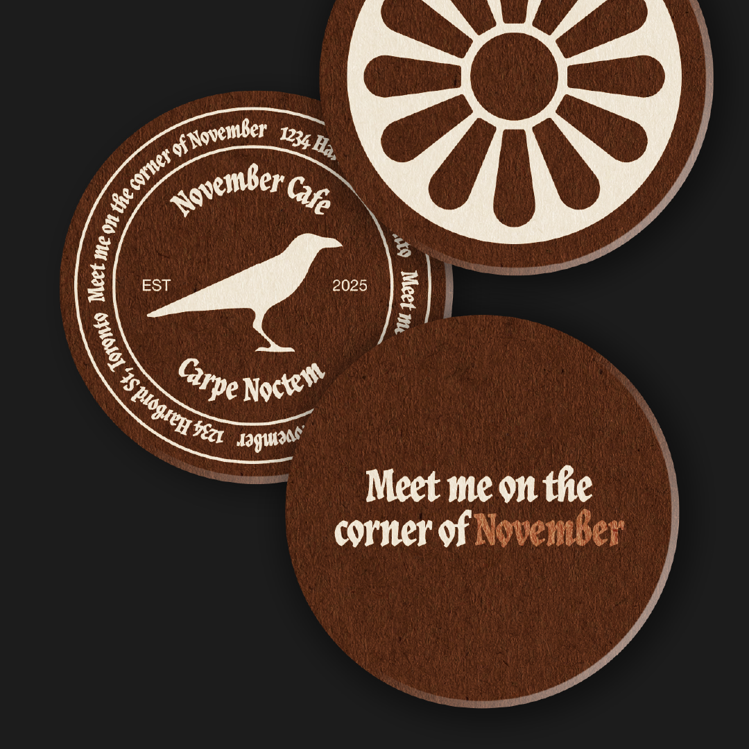
Logo & Typography
The crow icon was hand-drawn and digitized, while the wordmark uses the font JAF Herb. This font was chosen for it's legibility while still keeping a classic blackletter form. The final result is a logo that evokes a neo-gothic style while staying adaptable for different applications and channels.
Primary Logo
Secondary Logo
(left to right) Crest & Icons
Typography
The logo typeface is JAF Herb Condensed, while the body copy is Helvetica Neue. The pairing is the perfect balanced between old and neue (ha!), gothic and modern.
Colour Palette
The colour palette is reminiscent of a late autumn evening and coffee. The palette was chosen with interior design and web design in mind, hence the tonal range.
LAST DREG
HEX: #29160C
RGB: 41, 22, 12
CMYK: 0, 46, 71, 34
HEX: #29160C
RGB: 41, 22, 12
CMYK: 0, 46, 71, 34
TWO SUGARS
HEX: #4D3020
RGB: 77, 48, 32
CMYK: 0, 38, 58, 70
HEX: #4D3020
RGB: 77, 48, 32
CMYK: 0, 38, 58, 70
EARL GREY
HEX: #AB7B63
RGB: 171, 123, 99
CMYK: 0, 28, 42, 33
HEX: #AB7B63
RGB: 171, 123, 99
CMYK: 0, 28, 42, 33
COLD FOAM
HEX: #EFEADF
RGB: 239, 234, 223
CMYK: 0, 2, 7, 6
HEX: #EFEADF
RGB: 239, 234, 223
CMYK: 0, 2, 7, 6
Website Design
The website is heavily stylized, but remains legible and easy to navigate. The design is inspired by gothic architectural features, and the layout is based on illuminated manuscripts. The design was conceptulaized as mobile-first, and then adapted for desktop.
Mobile Screens
Desktop Screens
Extra
Every coffee shop needs a playlist: