2026
Celebrating MAC’s 50th Anniversary
Timeline
3 weeks
Client
Musée d'Art Contemporain de Montréal (Personal Project)
Industry
Art & Culture
Role
Art Director
Summary
This project was initially created in 2016 for one my graphic design classes. The brief was simple: create a logo for MAC’s 50th anniversary.
Ten years later, I thought it would be interesting to expand on it and create a cohesive a promotional campaign. This new version includes a modular logo that can adapt to different promotional applications, and better represents the tone and message of the campaign
Ten years later, I thought it would be interesting to expand on it and create a cohesive a promotional campaign. This new version includes a modular logo that can adapt to different promotional applications, and better represents the tone and message of the campaign
Strategy
Goal
To celebrate MAC’s (Musée d’Arts Contemporains de Montréal) 50th anniversary, I am creating a campaign with the aim of raising brand awareness and highlighting a cultural institution.
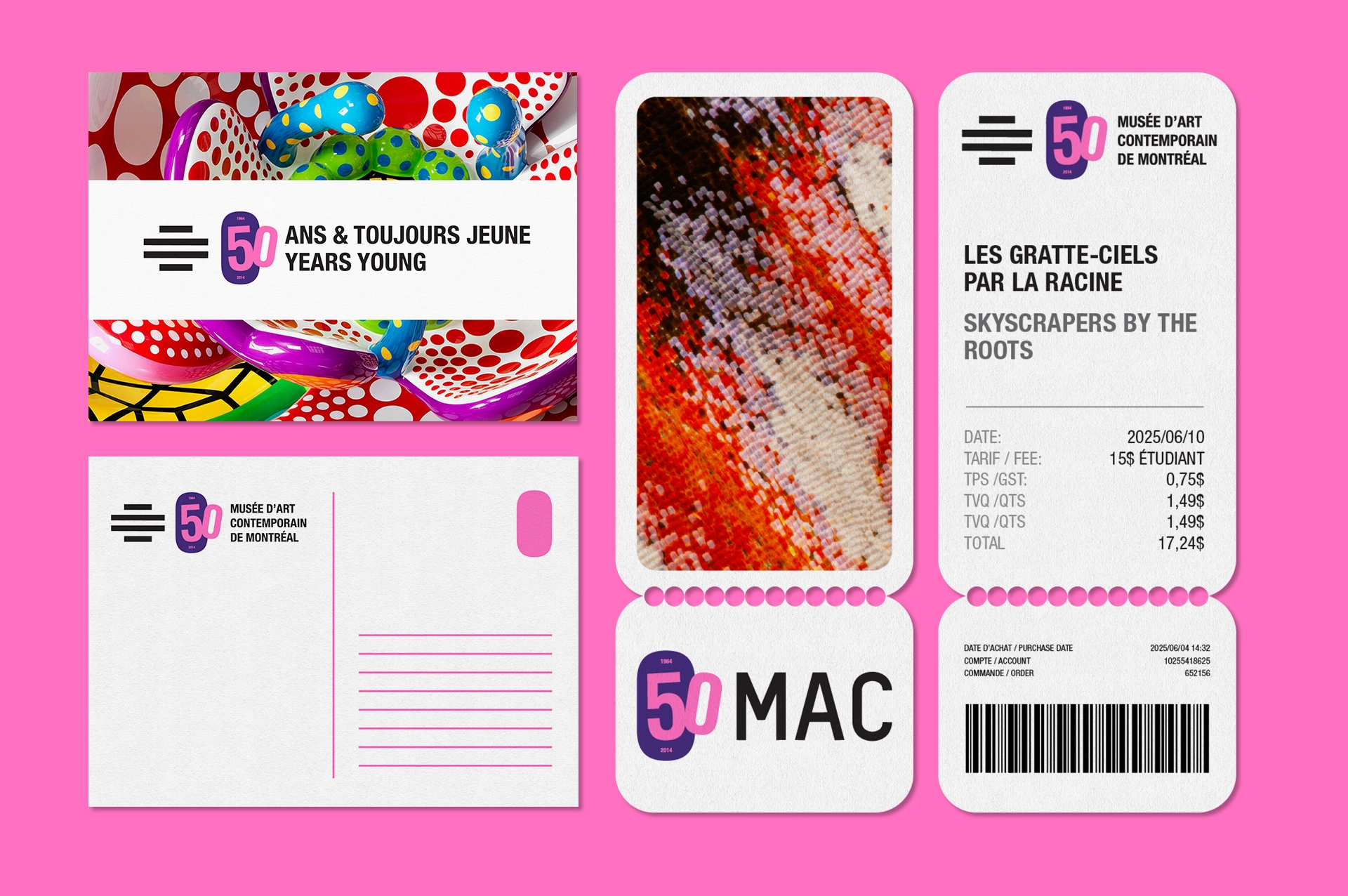
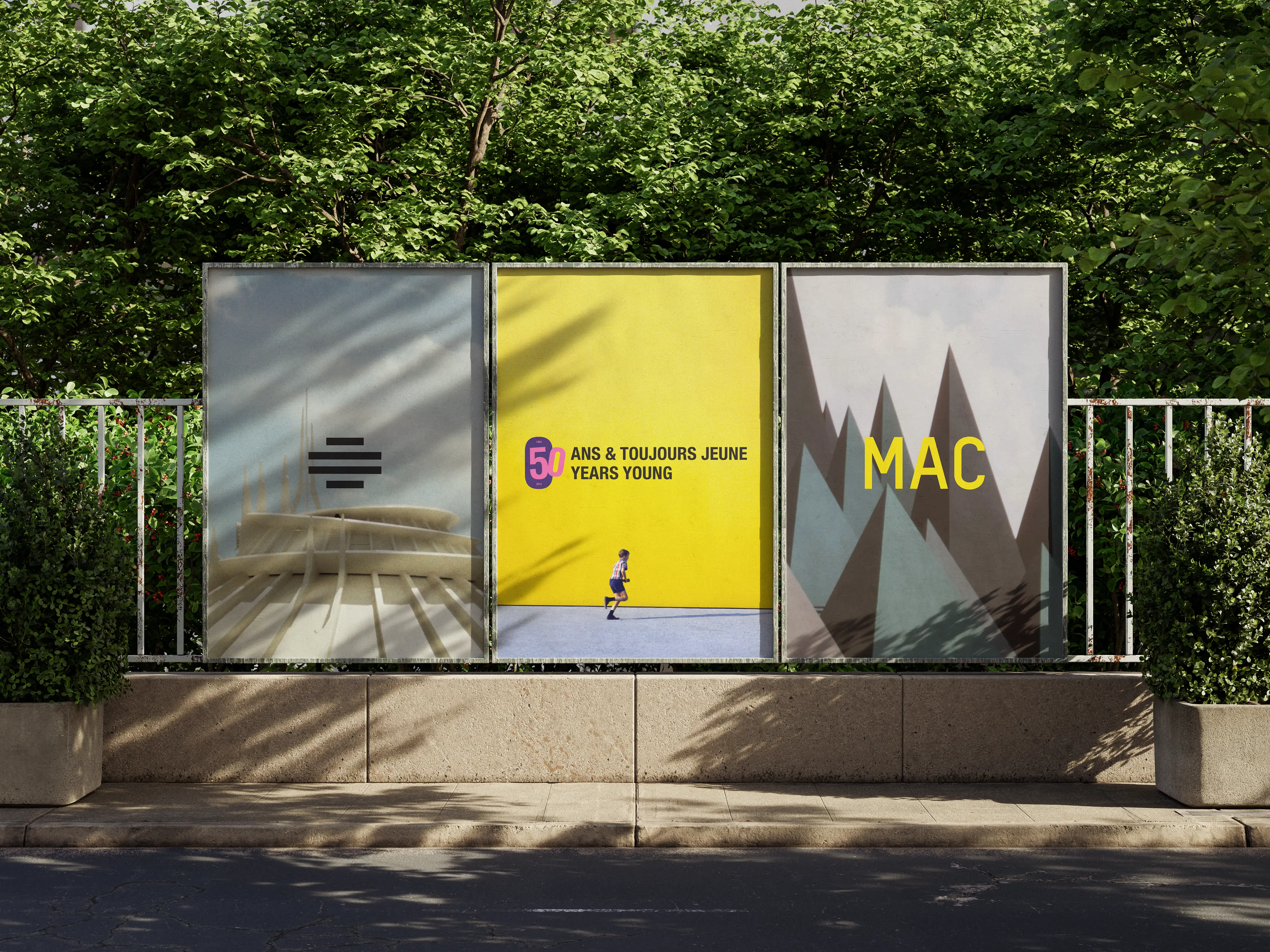
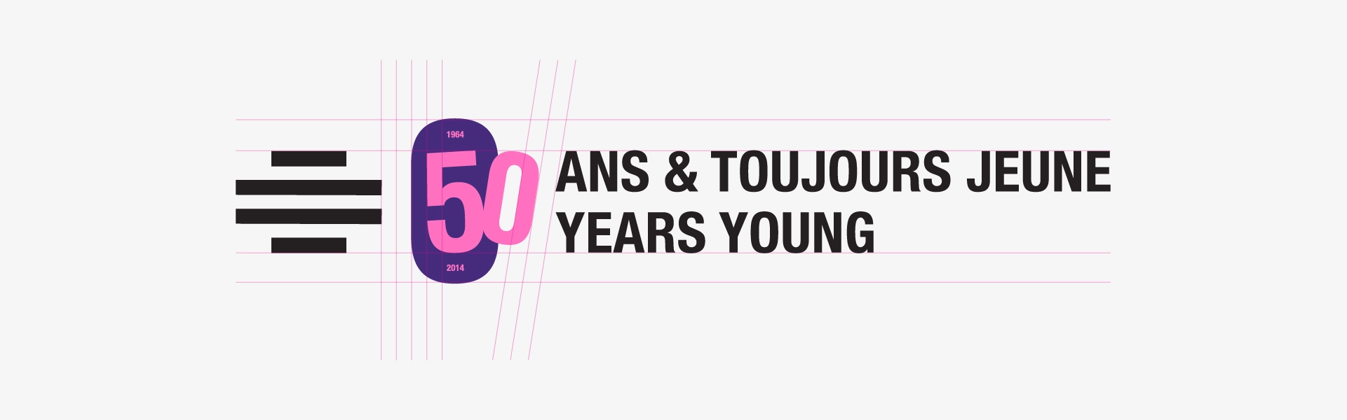
Solution: 50 Years Young
“50 Years Young” the goal of this anniversary campaign is to invite new patrons, as well as re-engage existing visitors. This is an opportunity to celebrate and highlight the importance of the MAC as a cultural pillar in Montreal. The execution is bold, dynamic and playful to embody the idea of being “50 Years Young” and reminding patrons of the MAC’s work supporting emerging talent.
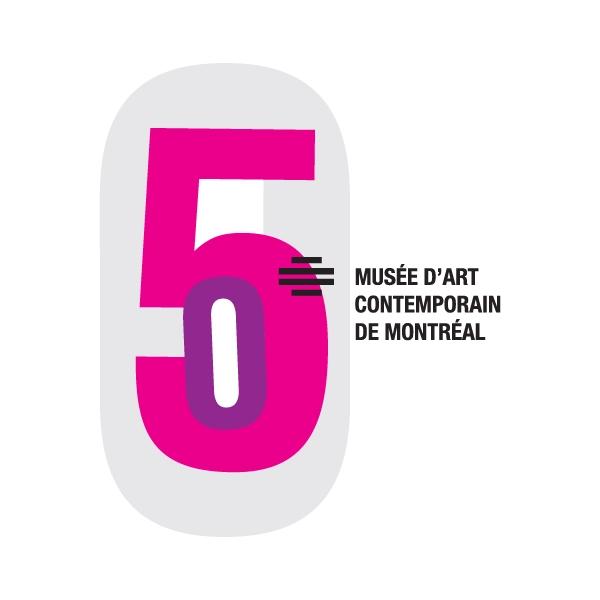
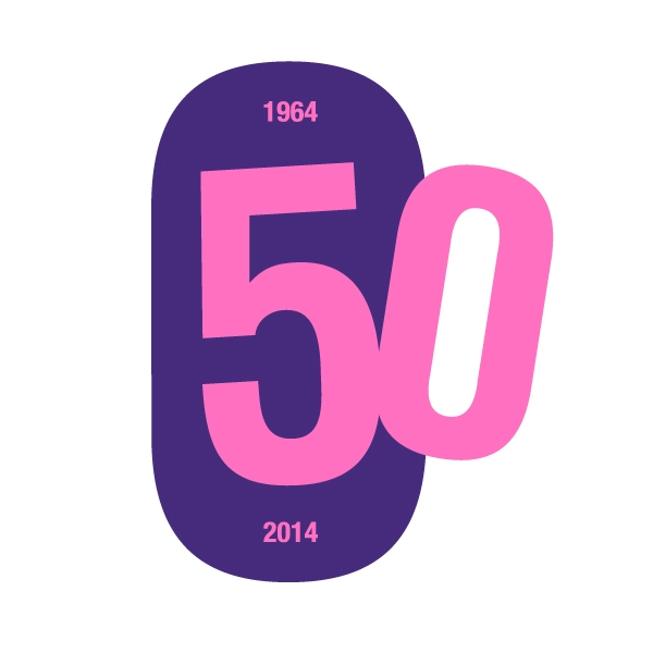
before (2016)
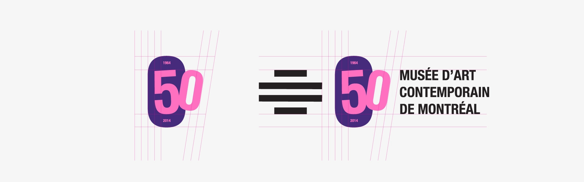
after (2026)
Development
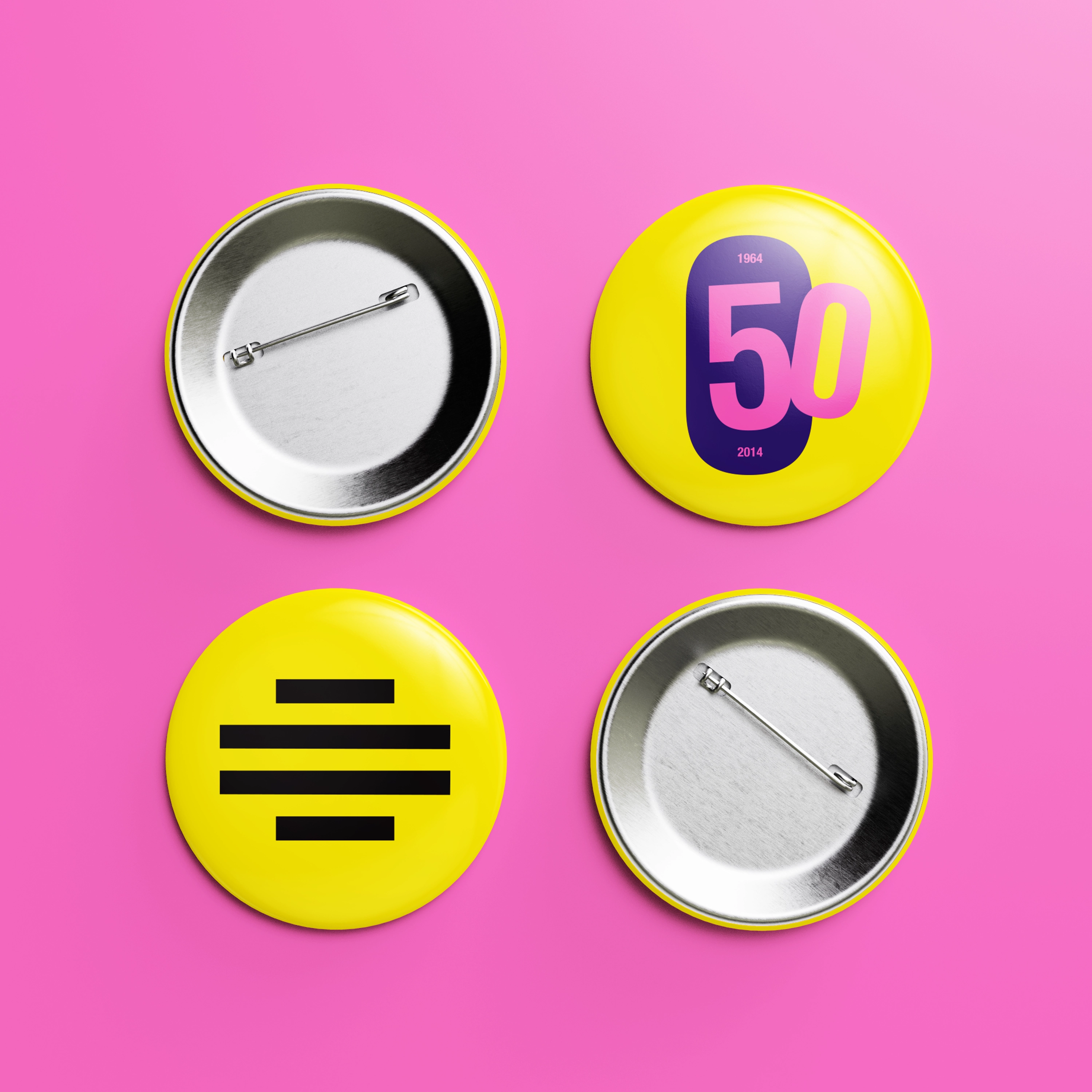
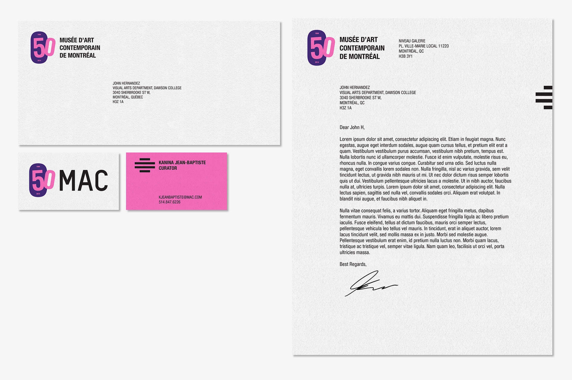
Logo Design & Refinement
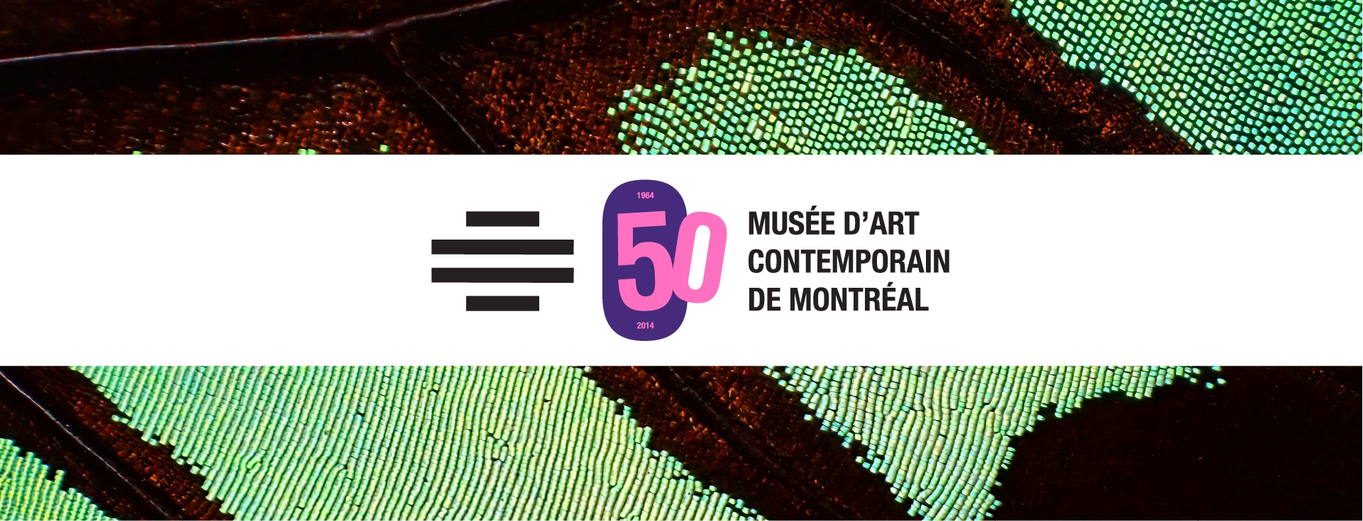
2016 vs 2026: The logo has been refreshed to be more legible and modular: the center “medallion” is the same form as the zero and it grounds all the other elements. It will also be used throughout the campaign to anchor other elements such as images, text, and patterns.

Development
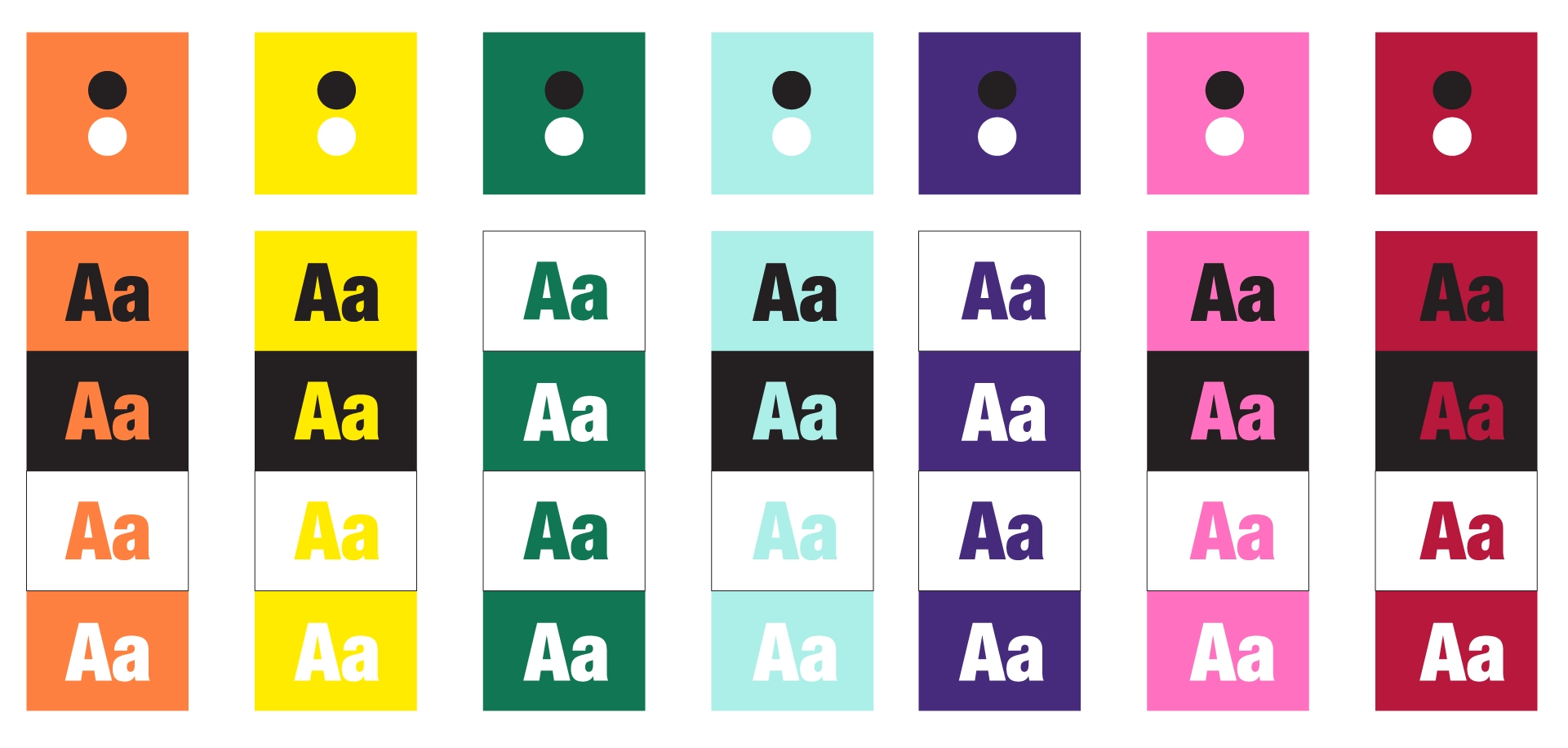
Colour Palette
The colour palette is bold, and celebratory. The focus on vibrant tones is reminiscent of the 60s which is when the MAC was founded (it’s also a culturally significant decade in Montreal with Expo 67, the opening of the Metro and development in the downtown core).
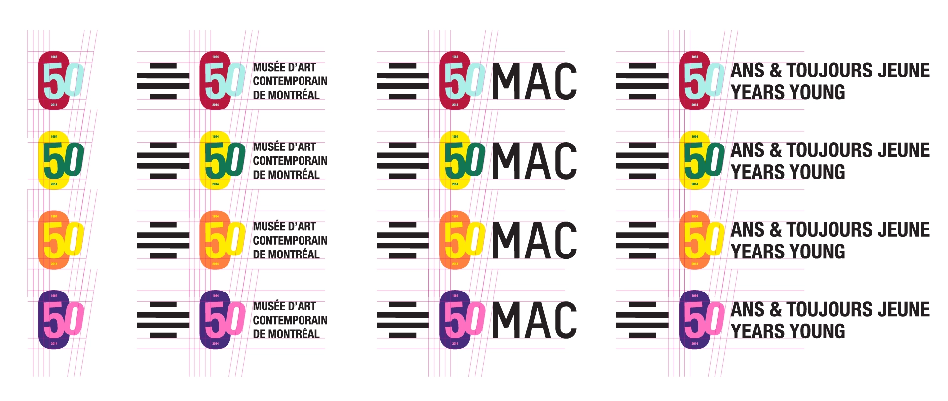
Font
The chosen font is Helvetica Neue, to match the MAC’s existing brand, and emulate the contemporary and minimal tone the campaign is going for.
Layout & Composition
The overall layout style for this campaign is based on Swiss design to follow the MAC’s existing brand. This layout also allows for versatility that is both direct and easy to read / engage with
Takeaway
It was interesting to redo a school project from ten years ago: the most noticeable change aside from the visuals is the shift from thinking like a designer to thinking like an art director. This time around, I had a better understanding of business goals (ie. brand awareness, market trends) and a better grasp on design research (ie. 60s-inspired campaign) which heavily informed the final output. The anniversary logo also no longer exists in a vacuum, but instead can change and adapt with the campaign depending on the application it is being used for.